Data Science and Computing with Python for Pilots and Flight Test Engineers
Advanced Statistics Plots with Seaborn
There a various plotting libraries, which allow the making of fancy data visualizations with just a few lines of code. A popular Python data visualization library based on Matplotlib is Seaborn. It can be added to your Python/Jupyter installation on your computer as usual as an Anaconda package (we have included it in our recommended installation). We illustrate an example below. See the Seaborn example gallery at URL https://seaborn.pydata.org/examples/index.html for more examples.
Seaborn takes the building blocks above and allows the user to create much fancier plots easily, sometimes with very few lines of code.
import numpy as np
import matplotlib.pyplot as plt

import seaborn as sns
df = sns.load_dataset("penguins") # loads the penguin example dataset from the seaborn module.
display(df)
df.to_csv('./penguin_dataset.csv', index=False) # Optional: saves the dataset to a separate csv file for possible further use.# Set a particular plot appearance theme:
# sns.set_theme(style="ticks")
# Note: Uncomment the line above for a nicer looking plot below (does not work with older seaborn versions).
# Create the pairplot of the penguin dataset with just one line of code:
sns.pairplot(df, hue="species")The resulting plot looks like this:
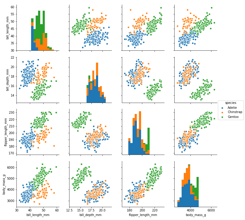
It is amazing what fancy plots and data visualizations are possible with just a few lines of code in Python. This is achieved thanks to all the different plotting modules available, such as Seaborn demonstrated here.
Yes, a little bit of coding is needed. It is not just pushing a couple of buttons in a GUI like in Microsoft Excel. In particular, if you want a particular plot, you may have to go online and look in the documentation of some of these Python modules like Matplotlib and Seaborn to find those few lines of code. But the flexibility and wide range of plotting options wildly exceeds those available in applications like Microsoft Excel.
As a somewhat more advanced plotting exercise, try to recreate the above Seaborn pairplot from scratch yourself using Matplotlib. You will have to learn how to create multi-panel plots, combine axes, etc. But it is a worthwhile exercise to get more control over the plots you create.