Data Science and Computing with Python for Pilots and Flight Test Engineers
Bode Plots
A Bode plot depicts the frequency response of a system, by plotting magnitude/gain and phase of a system as a function of angular frequency \(\omega\) in two plots usually placed one above another.
For a given control system described by a differential equation, such as
$$ \ddot x(t) + 2 \dot x(t) + 17 x(t) = f(t) $$
we can find the transfer function. For zero initial condition, it is for the above system
$$ H(s):=\frac{X(s)}{F(s)} = \frac{1}{s^2+2s+17}.$$
\(H(s)\) is a complex function of the complex variable \(s=\sigma + i\omega\) in the Laplace domain (i.e. a complex frequency, where \(\sigma\) is the total damping and \(\omega\) is the angular frequency (both being real numbers)).
The bode plot depicts magnitude and phase of \(H(s)\) as a function of real frequencies \(\omega\) while \(\sigma=0\), i.e. \(H(s)\) in the plot is evaluated at \(s=i\omega\), for all \(\omega\). Since the Bode plot depicts the frequency response of the system, important system properties can be read off such a Bode plot, for instance resonance frequencies and the phase and gain margins.
We will discuss the implications later, including rules for reading and hand-drawing Bode plots (the reader is also encouraged to consult the Bode plot article on Wikipedia). This lesson concerns itself merely with creating a Bode plot for our system with just a few lines of code. As we have been doing in many of our control theory lessons, we can do so either with the scipy.signal submodule of the SciPy library or with the control.matlab submodule of the python-control library.
Bode Plots with the scipy.signal Submodule of the SciPy Library
import numpy as np
import matplotlib.pyplot as plt

from scipy import signal
In order to display the Bode plot with the customary scales, we need to create our own plotting function for the Bode plot data we compute further below. The customary scales are horizontal axis of both plots on a logarithmic scale, and vertical axis of the phase plot on a linear scale, while the vertical axis of the magnitude plot can be on either on a logarithmic scale or – if plotting the \(magnitude=|H(s)|\) in dB (decibel), with \(gain [dB] := 20 \cdot \log_10 \cdot magnitude\) – on a linear scale. The plotting function below assumes that the magnitude is provided in [dB] and draws a linear scale for both vertical axes.
def draw_Bode_plot(w, mag, phase, color='tab:blue', filename=None):

    fig, (ax1, ax2) = plt.subplots(2, 1, figsize=(10,6))

    ax1.semilogx(w, mag, color=color) # Bode magnitude plot
    ax1.set_ylabel("Gain (Magnitude in [dB])")
    #ax1.set_xlabel("$\omega$")
    ax1.grid()

    ax2.semilogx(w, phase, color=color) # Bode phase plot
    ax2.set_ylabel("Phase")
    ax2.set_xlabel("$\omega$")
    ax2.grid()

    if filename is not None:
        plt.savefig(filename)

    plt.show()
Now that we have the plotting function ready, we can turn our attention to performing the Bode plot computation of the data to be shown. This is done very easily. As usual, we choose to set up the system in transfer function representation (tf), but any of the other two representations (zpk, ss) would work just as well (see our lessons on setting up control systems).
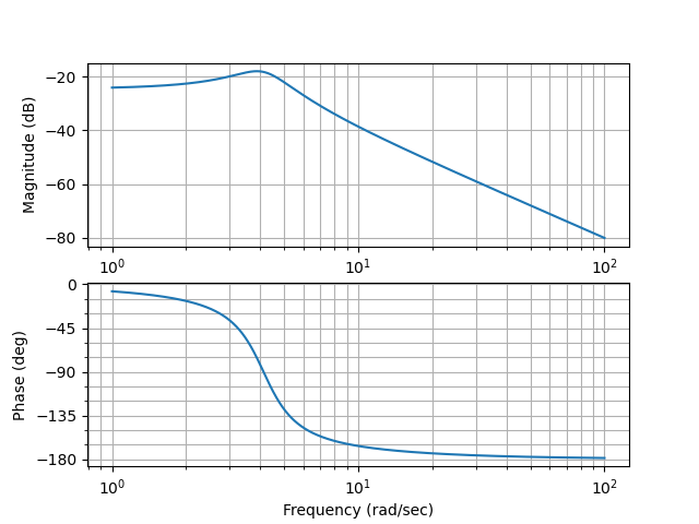
sys = signal.TransferFunction([1],[1,2,17])The data needed for the Bode plot can be generated with just one line of code, the bode() method of the scipy.signal submodule. The argument of the method is the instance of the lti class which represents our system. The second line call our plotting function above to display the data properly and save the plot to a file.
w, mag, phase = signal.bode(sys)
draw_Bode_plot(w, mag, phase, filename='./Bode_plot_with_scipy_library.pdf')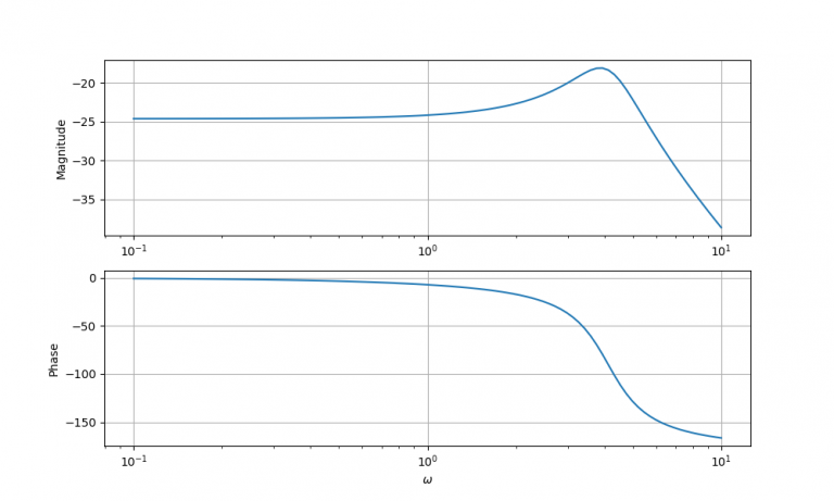
Illustrative Comparison to Previous Results
We can compare our result from the previous lesson against the above Bode plots. In that lesson, we used \(f(t)=\sin(3t)\) as our input function for the same system that we study here and obtained a magnitude of -20 dB and a phase roll-off of -36.867 degrees. This input function corresponds to \(\omega = 3\). We can verify above that if we enter the top Bode plot at \(\omega=3\), which corresponds to the second tick mark on the horizontal axis to the right of \(10^0\), we indeed find a magnitude of -20 dB. And in the bottom Bode plot the phase angle of ca. -37 degrees can also be verified.
The above illustrates how one point of the Bode plot came to be. And so are all the others. The Bode plots arise, if we probe the system with sinusoidal inputs with angular frequencies running through the whole plotting range, and record magnitude (amplitude ratio) and phase shift between the output sine wave and the input sine wave for each of these angular frequencies, which we then plot.
Bode Plots with the control.matlab Submodule of the python-control Library
import numpy as np
import matplotlib.pyplot as plt

from control.matlab import *
We set up the system in transfer function representation, but any of the other two representations would work just as well.
sys = tf([1],[1,2,17])The Bode plot can be generated with just one line of code, the bode() method of the control.matlab submodule of the python-control library. The argument of the method is again the system. Unlike in the previous section though, this method also generates the actual plots directly, without us needing to write additional code for plotting. If we also want to save the resulting plot to a file, we need to add the second line below.
w, mag, phase = bode(sys)
plt.savefig('./Bode_plot_with_python-control_library.pdf')