Data Science and Computing with Python for Pilots and Flight Test Engineers
Contour Plot in 2D
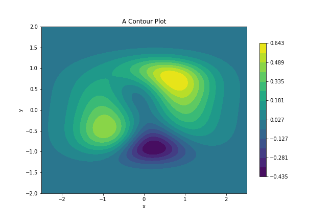
Contour plots are a way to illustrate 3-dimensional data. Two dimensions are plotted on the screen, and the third dimension is plotted by a certain color. The temperature of the surface of the earth would be one such example. The points on the screen denote the location on the earth and the color denotes the temperature.
For more examples, see for instance the Matplotlib website. You can also search for more examples on the internet.
import numpy as np
import matplotlib.pyplot as plt
def function2(x, y):
z = (x**2 + x*y + y**3) * np.exp(-(x**2 + y**4)) # this is the equation of the function we are plotting in this example.
return z# This creates a 2D grid of points where the function will be evaluated for plotting.
x = np.linspace(-2.5, 2.5, 100)
y = np.linspace(-2, 2, 100)
x, y = np.meshgrid(x, y)
# This assigns the values of function "function2" on that grid to variable z:
z = function2(x, y)
# Now create the contour plot:
# Set up the figure and axes:
fig, ax = plt.subplots()
# Set number of contours and make the plot:
levels = np.linspace(z.min(), z.max(), 15) # change the number here to change the number of contour levels in the plot.
plot1 = ax.contourf(x, y, z, levels=levels)
fig.colorbar(plot1, ax=ax, shrink=0.8) # adds the color bar on the right.
# Add optional axes labels and plot title:
plt.xlabel("x")
plt.ylabel("y")
plt.title("A Contour Plot")
plt.savefig("./contour_plot_in_2D.png") # optionally save the plot to a file on your hard drive.
plt.show()Copy and paste the above code cells into a Jupyter notebook on your computer and run them to see the two-dimensional contour plot.