Data Science and Computing with Python for Pilots and Flight Test Engineers
Gaussian Process Interpolation
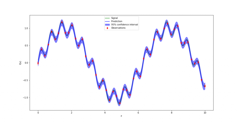
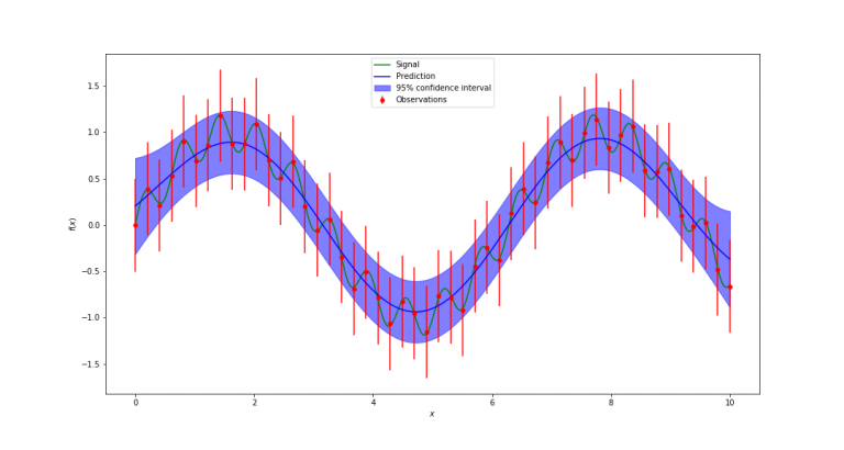
Gaussian process interpolation is quite a sophisticated form of interpolation of data points, which can take into account the error bars associated with the data points. In this lesson, we will implement a Gaussian process interpolation using the scikit-learn machine learning library. We will apply it to the same data set, but with different error bar assumptions, and see how we get two different results.
First, we need to import some functions from scikit-learn, in addition to the standard imports of NumPy and Matplotlib.
import numpy as np
import matplotlib.pyplot as plt

from sklearn.gaussian_process.kernels import ConstantKernel, RBF
from sklearn.gaussian_process import GaussianProcessRegressor
Next we create some sample data, which we will want to fit with this interpolation method afterwards. The example below is arbitrary and consists of two sine waves superimposed on top of each other. This will exquisitely emphasize how assumptions about the measurement errors can lead to different preferred interpolation results.
# Create some sample data which we want to fit:

def signal_function(x):
        y = np.sin(x) + 0.2 * np.sin(10.0*x)
        return y


def create_measurement_data(xdata):

        np.random.seed(1)

        number_of_data_points = xdata.shape[0]
        measurement_noise = 0.05 * (np.random.rand(number_of_data_points) - 0.5)
        ydata = signal_function(xdata) + measurement_noise
        return ydata
Finally, the function performs the actual Gaussian process interpolation and plots the result:
def gaussian_process_interpolation(xdata, ydata, dy_error, filename=None):
        """ Function which creates the Gaussian process interpolation.
            xdata is the horizontal axis value of the data points,
            ydata is the vertical axis value of the data points (the actual measurement),
            dy_error is the standard deviation of the ydata measurements, i.e. the statistical measurement error."""

        # Reformat the xdata array into a shape the interpolator code can use.
        Xdata = np.atleast_2d(xdata).T

        Ydata = ydata
        dy_error_standard_deviation = dy_error

        # For plotting purposes, grid on which function will be plotted:
        x = np.atleast_2d(np.linspace(xdata[0], xdata[-1], 1000)).T

        # Create an instance of the Gaussian Process model:
        #kernel = C(1.0, (1e-3, 1e3)) * RBF(1.0, (1e-2, 1e2))
        kernel = ConstantKernel(constant_value=1.0, constant_value_bounds=(1e-3, 1e3)) * RBF(length_scale=1.0, length_scale_bounds=(1e-2, 1e2))
        gp = GaussianProcessRegressor(kernel=kernel, alpha=dy_error_standard_deviation ** 2, n_restarts_optimizer=9)

        gp.fit(Xdata, Ydata) # determine Gaussian process hyperparameters based on fit to data, taking into account assumed standard deviation of measurement error.

        # Predict values at additional points, between data points (for plotting purposes)
        y_prediction, sigma = gp.predict(x, return_std=True) # use this to make predictions about other points along x-axis, e.g. for plotting.

        # Make plot of data points (with error bars), actual signal from which data was drawn, as well as the Gaussian process fit through the data points with 95% confidence intervals:
        plt.figure(figsize=(15,8))
        plt.errorbar(xdata, ydata, dy_error_standard_deviation, fmt='r.', markersize=10, label='Observations') # data points.
        plt.plot(x, signal_function(x), color='green', label='Signal') # signal
        plt.plot(x, y_prediction, color='blue', label='Prediction') # gaussian process prediction/interpolation
        plt.fill_between(x.ravel(), y_prediction.ravel() - 1.9600 * sigma, y_prediction.ravel() + 1.9600 * sigma, alpha=.5, color="blue", label='95% confidence interval') # uncertainty of interpolation.
        plt.xlabel('$x$')
        plt.ylabel('$f(x)$')
        plt.legend(loc='upper center')

        if filename is not None:
            plt.savefig(filename)
        plt.show()
Now all that is left is to run the Gaussian process interpolation with the code cell below. We run it twice, assuming two different sizes of error bars on the data. This will lead correspondingly to two different results. With the small error bars, we tend to believe the existence of the superimposed, low-amplitude high-frequency sine wave, whereas with the large error bars, we attribute the deviations from the high-amplitude low frequency sine waves to scatter due to measurement error, rather than believing in a second sine wave being present.
# Create some sample data:
xdata = np.linspace(0, 10, 50)
ydata = create_measurement_data(xdata)


# Now interpolate, using Gaussian Process interplation and an assumed measurement error standard deviation of dy_error:
filename = './gaussian_process_interpolation_small_errorbar.png'
dy_error = 0.05 # assuming a small measurement error.
gaussian_process_interpolation(xdata, ydata, dy_error, filename)


filename = './gaussian_process_interpolation_large_errorbar.png'
dy_error = 0.5 # assuming a large measurement error.
gaussian_process_interpolation(xdata, ydata, dy_error, filename)


