Data Science and Computing with Python for Pilots and Flight Test Engineers
Multiple Vertical Axis Plot
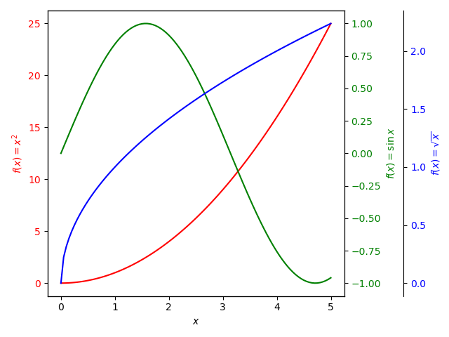
Adding a second vertical axis is not the end. We can add more. We can make a third vertical axes, which either is overlaid over the second, or which is plotted offset to the right a bit with a separate spine. The example below implements the version with the spine. It is very similar to the twin axis plot described in the previous lesson, with some additions for the third vertical axis and third curve. (To remove the extra spine and offset of the third vertical axis, simply comment out the corresponding line of code below, which creates it.)
import numpy as np
import matplotlib.pyplot as plt
# Create some data to be plotted:
xdata = np.linspace(0.0, 5, 101)
ydata1 = xdata * xdata
ydata2 = np.sin(xdata)
ydata3 = np.sqrt(xdata)fig, ax1 = plt.subplots()
color = 'red'
ax1.set_xlabel('$x$')
ax1.set_ylabel('$f(x) = x^2$', color=color)
ax1.plot(xdata, ydata1, color=color)
ax1.tick_params(axis='y', labelcolor=color)
ax2 = ax1.twinx() # create a second vertical axes for the plot (based on the same horizontal axis).
color = 'green'
ax2.set_ylabel('$f(x) = \sin x$', color=color) # no need to create an x-axis label, because ax1 already has it.
ax2.plot(xdata, ydata2, color=color)
ax2.tick_params(axis='y', labelcolor=color)
ax3 = ax1.twinx() # create a third vertical axes for the plot (based on the same horizontal axis).
ax3.spines.right.set_position(("axes", 1.2)) # offsets the third vertical axis to the right with its own spine.
color = 'blue'
ax3.set_ylabel('$f(x) = \sqrt{x}$', color=color) # no need to create an x-axis label, it is shared with ax1.
ax3.plot(xdata, ydata3, color=color)
ax3.tick_params(axis='y', labelcolor=color)
fig.tight_layout() # avoids clipping at the edges of the plot.
plt.show()