Data Science and Computing with Python for Pilots and Flight Test Engineers
Twin Axis Plot
In the figure below, we again plot two functions. But in order to fill the plot better, we give each function a separate vertical axis, one labeled on the left-hand side of the plot, and the other on the right hand side of the plot. This is useful, if you want to plot two functions \(y = f(x)\) with greatly different \(y\) values in the same plot over the same range of \(x\).
import numpy as np
import matplotlib.pyplot as plt
# Create some data
xdata = np.linspace(0.0, 5, 101)
ydata1 = xdata * xdata
ydata2 = np.sin(xdata)fig, ax1 = plt.subplots()
color = 'red'
ax1.set_xlabel('$x$')
ax1.set_ylabel('$f(x) = x^2$', color=color)
ax1.plot(xdata, ydata1, color=color)
ax1.tick_params(axis='y', labelcolor=color)
ax2 = ax1.twinx() # create a second vertical axis for the plot, which shares the same horizontal axis.
color = 'green'
ax2.set_ylabel('$f(x) = \sin x$', color=color)
ax2.plot(xdata, ydata2, color=color)
ax2.tick_params(axis='y', labelcolor=color)
fig.tight_layout() # avoids clipping at the edges of the plot.
plt.show()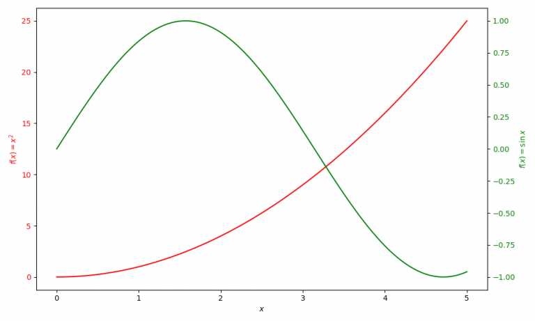
The above code contains the subplots function from Matplotlib. We will encounter it again in future lessons, where we will learn how to create multiple subplots in one plot.